

せっかくpythonを使っているので、どうせならエクセル無しでグラフを書けたらいいなと思い、matplotlibで基本的な棒グラフを書いてみました。
今回は、
Home literacy activities: Accounting for differences in early grade literacy outcomes in low-income families in Zambia
という論文に出てくるデータを使ってグラフを作っていきたいと思います。
目次
デフォルトの棒グラフ
初めに、xに棒グラフのx軸の要素を代入します。
from matplotlib import pyplot as plt
x = ["9-years of formal education",'senior secondary education','college qualification']
fig = plt.figure()
plt.bar(x, 100, width=0.8)
plt.xlabel('Fig.1 parents sorted by educational backgrounds(n=122)')
plt.ylabel('%')
fig.savefig('figusize.jpg',dpi=500)
出力結果を見てみます。
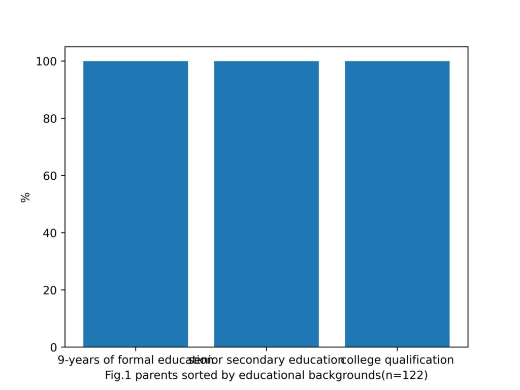
x軸の要素が被っていますね。
軸上の被りを取り除くメソッド
tight_layout()
を発見したので、試してみます。
from matplotlib import pyplot as plt
x = ["9-years of formal education",'senior secondary education','college qualification']
fig = plt.figure()
plt.bar(x, 100, width=0.8)
plt.xlabel('Fig.1 parents sorted by educational backgrounds(n=122)')
plt.tight_layout()
plt.ylabel('%')
fig.savefig('c.jpg',dpi=500)
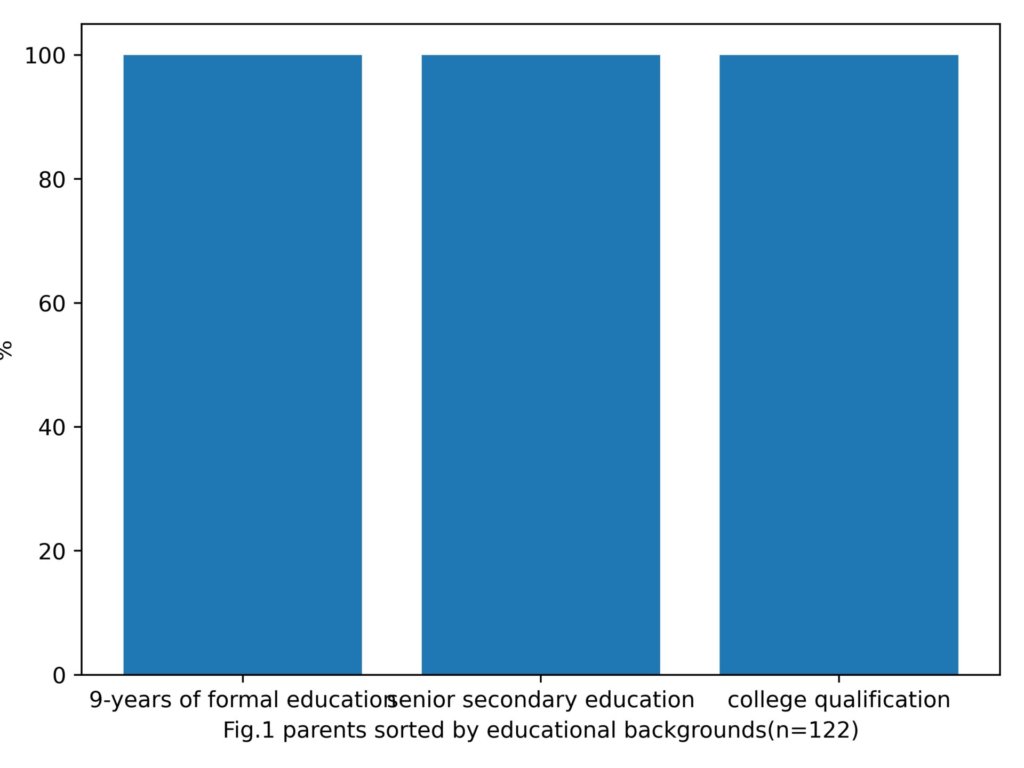
なんかy軸のラベルがはみ出てるし、x軸の要素も被ってますね。
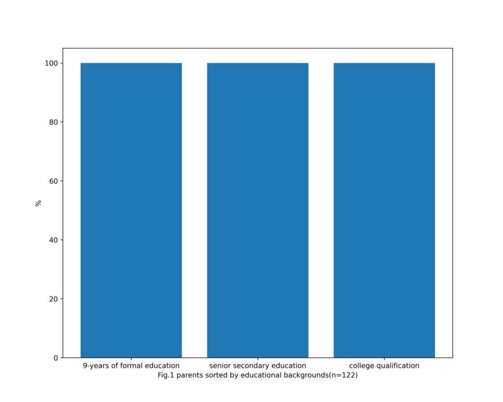
直接グラフの領域を広げてみます。
これは、グラフのインスタンスを作成する際に、figure()の引数にタプルまたはリスト型の[幅、高さ]を渡してあげることで任意のサイズのグラフを作成することができます。
from matplotlib import pyplot as plt
x = ["9-years of formal education",'senior secondary education','college qualification']
fig = plt.figure(figsize=[10,8])
plt.bar(x, 100, width=0.8)
plt.xlabel('Fig.1 parents sorted by educational backgrounds(n=122)')
plt.ylabel('%')
fig.savefig('c.jpg',dpi=500)
出力結果
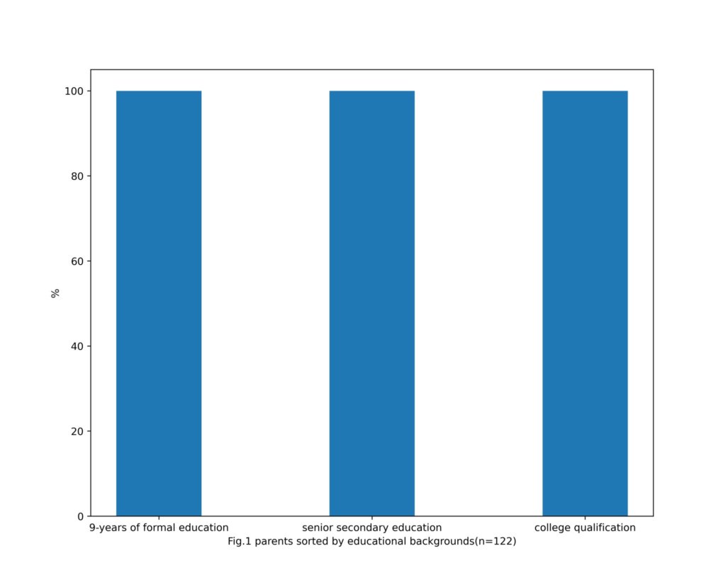
plt.bar(x, 100, width=0.4)とすることで、棒の大きさを変更しておきました。
男女での比較を見やすく
次に、データを父親と母親にわけて、その棒グラフを隣同士に配置してみたいと思います。
ここでのポイントは、棒グラフのカラーの指定です。
デフォルトから少し書き換えています。
from matplotlib import pyplot as plt
x = ["a-mother",'a-father',"b-mother",'b-father',"c-mother",'c-father']
y = [85,43,11,43.1,4.2,13.9]
fig = plt.figure(figsize=[12,8])
width = 0.6
plt.bar(x,y,color=['orchid','royalblue','orchid','royalblue','orchid','royalblue'],width=width)
plt.xlabel('Fig.1 parents sorted by educational backgrounds\n(n=122,a:9-years of formal education,b:senior secondary education,c:college qualification)')
plt.ylabel('%')
fig.savefig('c.jpg',dpi=500)
bar()インスタンスに色のリスト(左から順に)を渡してcolorを指定することができます。
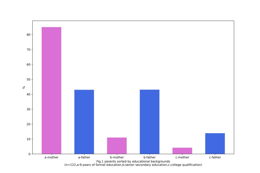
見やすいかわかりませんが、3つの系列について、男女それぞれの比較を一枚の図で行えているかと思います。

