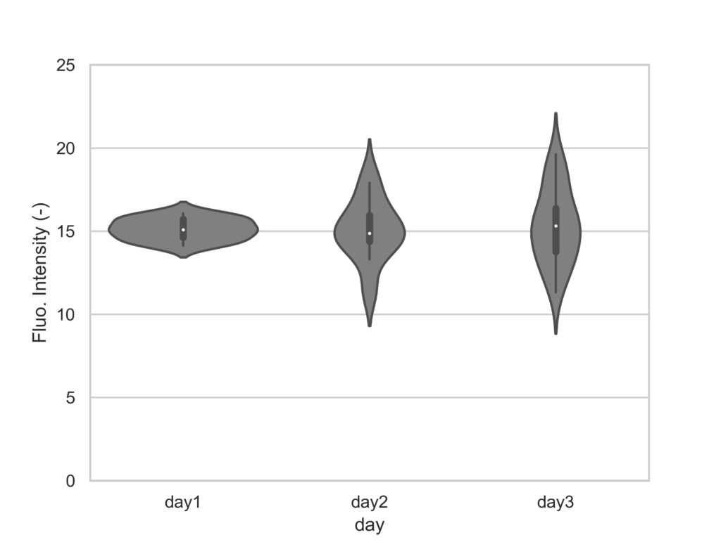

時系列ごとの分布を一目で確認する際に便利なバイオリンプロットをPythonで描画するテンプレートを置いておきます。
import numpy as np
import pandas as pd
from matplotlib import pyplot as plt
import seaborn as sns

plt.style.use('default')
sns.set()
sns.set_style('whitegrid')
sns.set_palette('gray')

df = pd.DataFrame({
    'day1': np.random.normal(15, 1, 20),
    'day2': np.random.normal(15, 2, 20),
    'day3': np.random.normal(15, 2.5, 20)
})

df_melt = pd.melt(df)
print(df_melt.head())

fig = plt.figure()
ax = fig.add_subplot(1, 1, 1)

sns.violinplot(x='variable', y='value', data=df_melt, jitter=True, color='gray', ax=ax)
ax.set_xlabel('day')
ax.set_ylabel('Fluo. Intensity (-)')
ax.set_ylim(0, 25)
fig.savefig("a.png",dpi = 500)
実行結果