

グラフの描画には、Rやmatlabなどの専用ソフトを使うと綺麗に作れますが、pythonでもmatplotlibを使うと同じようにグラフを書くことができます。
目次
グラフ作成の基本
モジュールをインポートしますが、pltという呼び名がよく使われています。
from matplotlib import pyplot as plt さらに、数学的な計算ができるようにmathモジュールとrandomモジュールも入れておきます。
import random
import math
インスタンスの生成
オブジェクト指向言語のいいところで、インスタンス(ここではグラフ)を生成することで、あとはそこに上乗せするイメージで直感的にグラフを書くことができます。
def fact(x):
    if x == 0:
        return 1
    else:
        return x * fact(x - 1)
ポアソン分布に出てくる階乗計算用に再帰関数を定義しておきます。
#インスタンスの生成
fig = plt.figure()
#リスト型でないといけないことに注意
#xとyは同じ長さであること
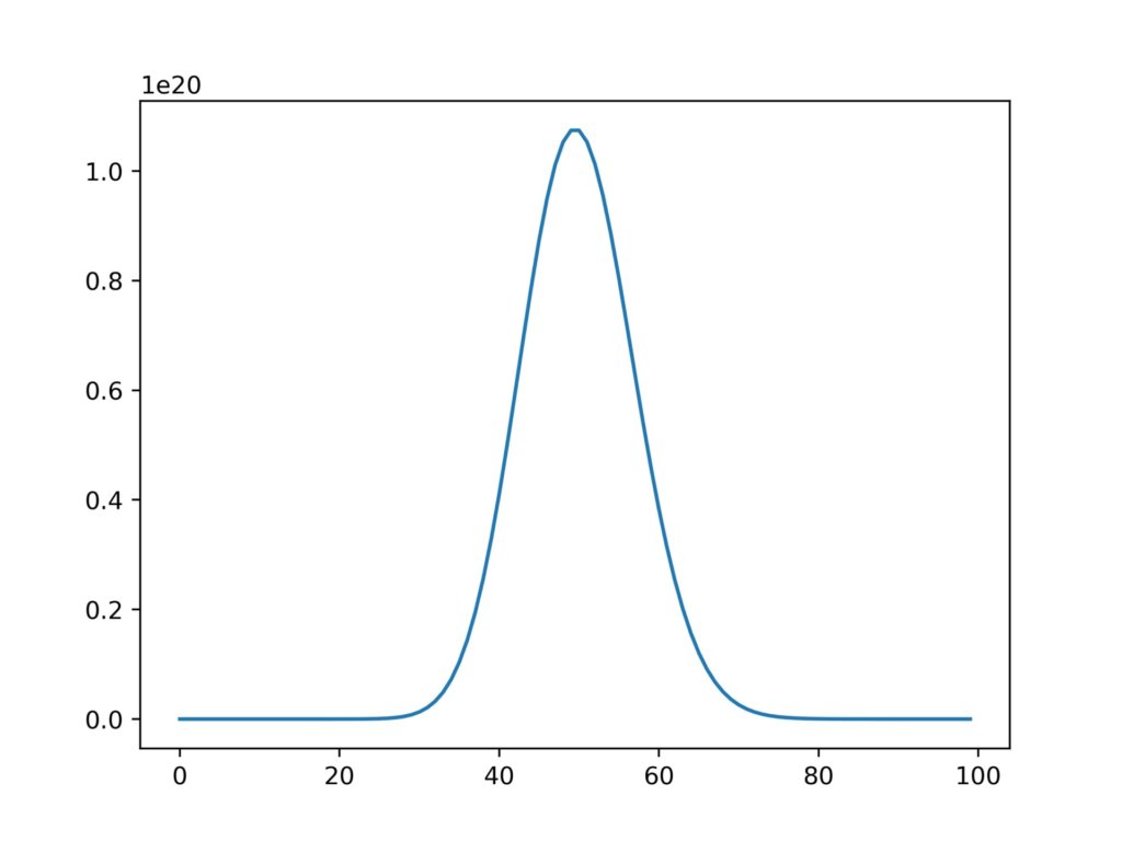
x = [i for i in range(100)]
#ポアソン分布
y = [(50**i)/(fact(i)*math.e) for i in range(len(x))]
plt.plot(x,y)
#画像書き出し
fig.savefig('graph.jpg',dpi=500)
#画像表示
plt.show実行結果
2つ以上のグラフを重ねる
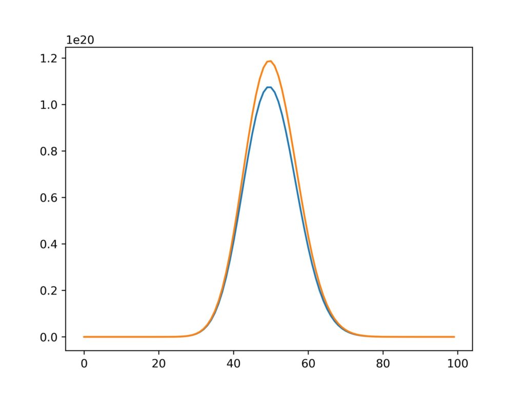
もちろん二つ以上のグラフを重ねることもできます。
fig = plt.figure()
x = [i for i in range(100)]
y1 = [(50**i)/(fact(i)*math.e) for i in range(len(x))]
y2 = [(50.1**i)/(fact(i)*math.e) for i in range(len(x))]
plt.plot(x,y1)
plt.plot(x,y2)
fig.savefig('graph.jpg',dpi=500)
実行結果
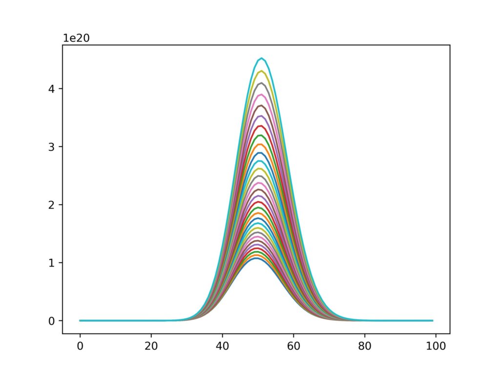
さらにループで回してみます。
fig = plt.figure()
for k in range(30):
    x = [i for i in range(100)]
    yi = [((50+0.05*k)**i)/(fact(i)*math.e) for i in range(len(x))]
    plt.plot(x,yi)
fig.savefig('graph2jpg',dpi=500)
実行結果
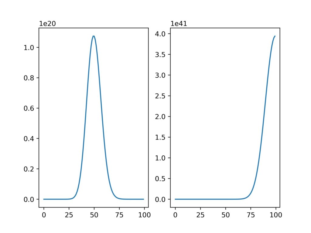
グラフの分割
グラフの分割も、インスタンスに加工を加えていくイメージです。
fig = plt.figure()
x = [i for i in range(100)]
y1 = [(50**i)/(fact(i)*math.e) for i in range(len(x))]
y2 = [(100**i)/(fact(i)*math.e) for i in range(len(x))]
axis = fig.add_subplot(1,2,1)
axis.plot(x,y1)
axis = fig.add_subplot(1,2,2)
axis.plot(x,y2)
add_subplotの部分は、(縦のグラフ数、横のグラフ数、グラフ番号)で指定することができます。
実行結果
散布図
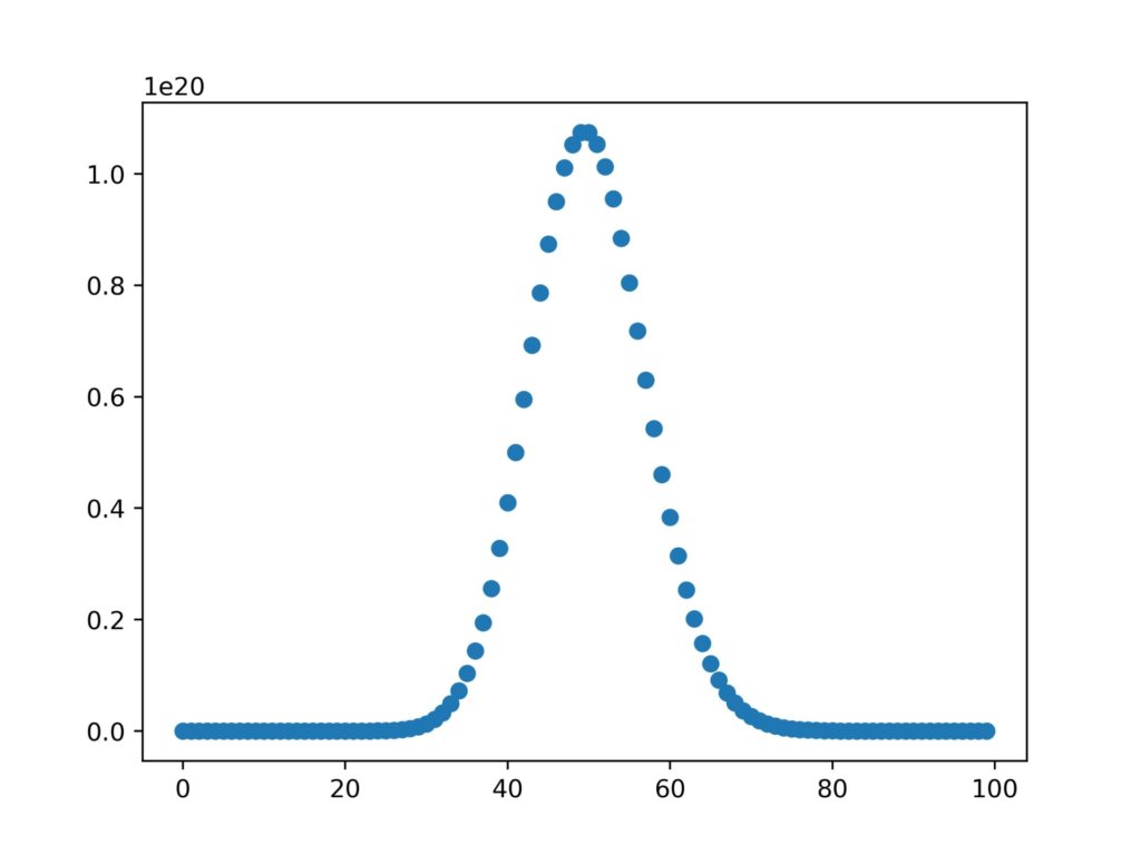
plt.scatter()を使用して散布図を書くこともできます。
fig = plt.figure()
x = [i for i in range(100)]
y1 = [(50**i)/(fact(i)*math.e) for i in range(len(x))]
y2 = [(100**i)/(fact(i)*math.e) for i in range(len(x))]
plt.scatter(x,y1)
実行結果
散布図が描けるようになったので、次回は実験データを用いてガウシアンフィッティングをやってみようと思います。

