
自分用にmatplotlibを使ったグラフを作成する関数を残しておきます。
データは吸光度を使ってみます。
x = [100,500,1000]
y = [1.20,0.500,0.306]
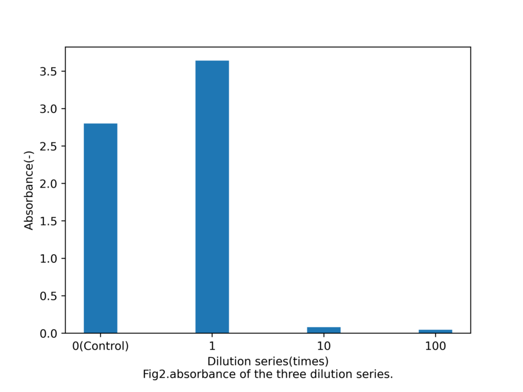
x1 = [0,1,10,100]
x1 = [10,20,30,40]
y1 = [2.80,3.64,0.080,0.046]目次
散布図作成
散布図の場合、ラベルに気をつける必要。
import matplotlib.pyplot as plt
from oddata import x,y,x1,y1

def generate_scatter_plot(x,y):
    fig = plt.figure()
    graph_title = 'Fig1.absorbance of the three dilution series.'
    x_label = 'Dilution series(times)'
    y_label = 'Absorbance(-)'
    graph_name = 'graph_scatter.png'
    label = [100,500,1000]
    ax = fig.add_subplot(111)
    ax.grid()
    ax.scatter(x, y,s=30)
    ax.set_xticks(label)
    ax.set_xlabel(x_label+'\n'+graph_title)
    ax.set_ylabel(y_label)
    fig.subplots_adjust(bottom=0.15)
    fig.savefig(graph_name,dpi = 500)
実行結果
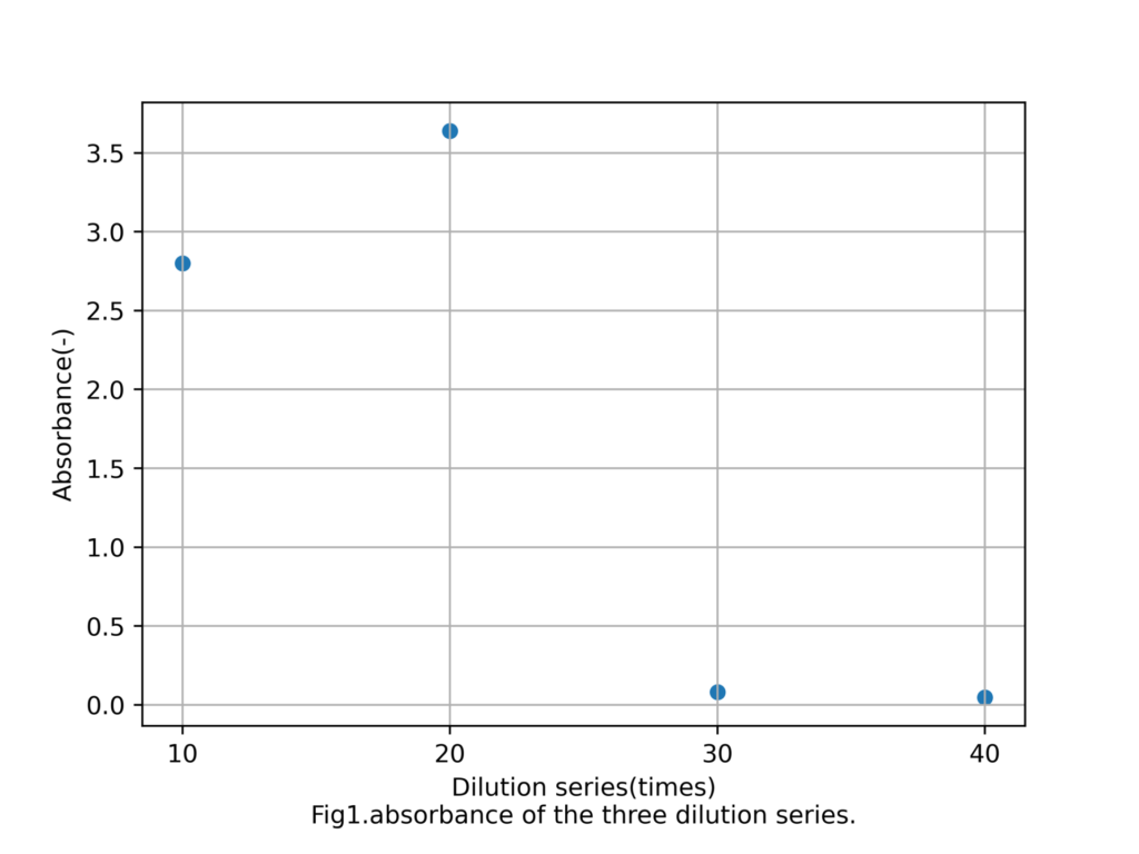
棒グラフの作成
棒グラフの場合もラベルに気をつけるだけ。
import matplotlib.pyplot as plt
from oddata import x,y,x1,y1

def generate_bar(x,y):
    fig = plt.figure()
    label = ['0(Control)','1','10','100']
    graph_title = 'Fig2.absorbance of the three dilution series.'
    x_label = 'Dilution series(times)'
    y_label = 'Absorbance(-)'
    graph_name = 'graph_bar.png'
    ax = fig.add_subplot(111)
    ax.bar(x, y, tick_label=label,width =3)
    ax.set_xlabel(x_label+'\n'+graph_title)
    ax.set_ylabel(y_label)
    fig.subplots_adjust(bottom=0.15)
    fig.savefig(graph_name,dpi = 500)

generate_bar(x1,y1)
実行結果